

Visualising xG and xPts: Insights beyond mean outcomes and potential tactical insights
Visualising xG and xPts: Insights beyond mean outcomes and potential tactical insights

Motivation: a Premier League ‘record’
Liverpool’s 4-2 win over Newcastle on New Year’s Day broke the Premier League xG record. While some punters chortled at this ‘record’ (“is there a trophy for that?”), some interesting questions arise.
A reflexive response was “Liverpool should’ve scored more”. Quite! But, how much more? How unlucky (or ‘bad’) was it to only manage 4?
Most outlets had the xG somewhere in the range of Liverpool 7-1 Newcastle, which also represented a record for xG difference. This is about as dominant as it gets, but how does it compare to more commonly seen xG differences of around 2 or 3?
If you’re asking yourself “what’s xG?”, see a great explanation from FBref here.

The idea of ‘expected points’ (xPts) is a way to partly answer these questions. Expected points takes the xG of each shot to calculate (or simulate) how often each team will win, lose or draw the game. Once you have those probabilities, you can quickly calculate how many points each team was ‘expected’ to get from the game. Liverpool’s record xG performance translated to an xPts of 3.0 (remarkably, winning ~100% of the time). I’ll get to a few more examples below.
xPts are useful in the aggregate as they show over- and underperformance over the course of a season. (See for example, this from Tony El Habr). But, on an individual game, you’ll often get unwiedly figures like 1.3 or 2.2 that are hard to interpret. After all, they call them six pointers, not 4.4 pointers. Perhaps some simple visualisation can help?
Before we go on - obviously all of the below comes with all the same caveats that xG itself does. For example, it doesn’t account for game state (e.g. one team takes the lead early and then sits back). Nonetheless, I think it’s illustrative. It’s also worth noting that different outlets have different xG models and calculations. The differences are usually quite small, and not meaningful for our purposes here.
What to expect? A range of outcomes!
The visualisation below sheds more light on xG and xPts. The idea is to show how xG translates to the range of possible/ likely match outcomes, adding more context to the otherwise standalone figures. This context - the likelihood of the actual outcome and other potential outcomes - gives us a better sense of just how lucky (or good, or bad) a team was on a given day.
Liverpool justifiably expecting more
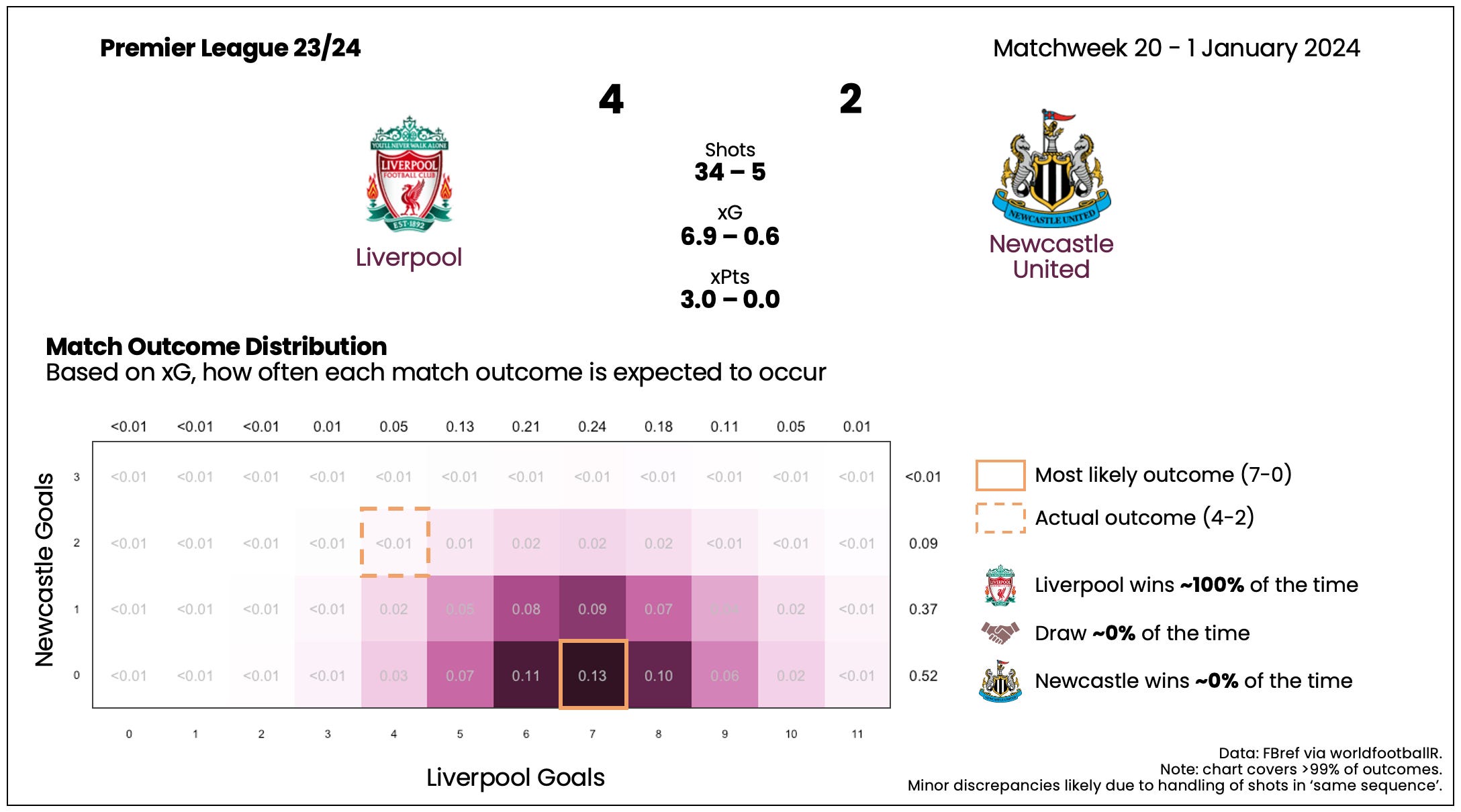
Yes, Liverpool win virtually 100% of the time, with the most likely outcome a 7-0 win (~13% of the time).
The actual result, 4-2, was very unlikely - occuring <1% of the time. In fact, Newcastle only manage to lose by 2 or less about 1% of the time.
Liverpool only score 4 or fewer goals about 7% of the time. They’d have been almost as likely to score 10 or more!
Here’s a few more interesting ones from the 23/24 Premier League, starting in Matchweek 3.
Fulham pinch a point

This one also helps to illustrate just how dominant Liverpool’s 6.9 - 0.6 xG performance was. Despite a huge xG difference here of 2.5, Arsenal were only expected to win about 92% of the time, with Fulham snatching a result about 8% of the time. And, lo and behold, they did.
A big out-Villa-ier result
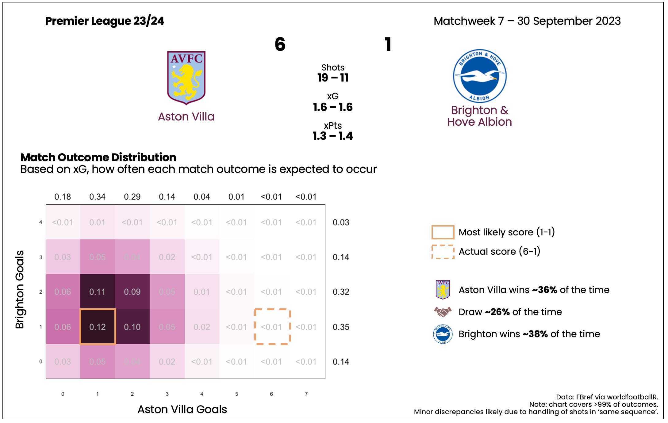
Remarkably, Brighton could have reasonably expected to have won this game - even after the fact! The Seagulls got what they deserved at one end of the pitch - scoring 1 - but were desperately unlucky at the other end. Villa had less than 1% chance of scoring 6 or more based on the shots they had. Villa were aided by an own goal, which helps to explain some of their fortune. Still, a massive outlier result.
Lucky Man United?
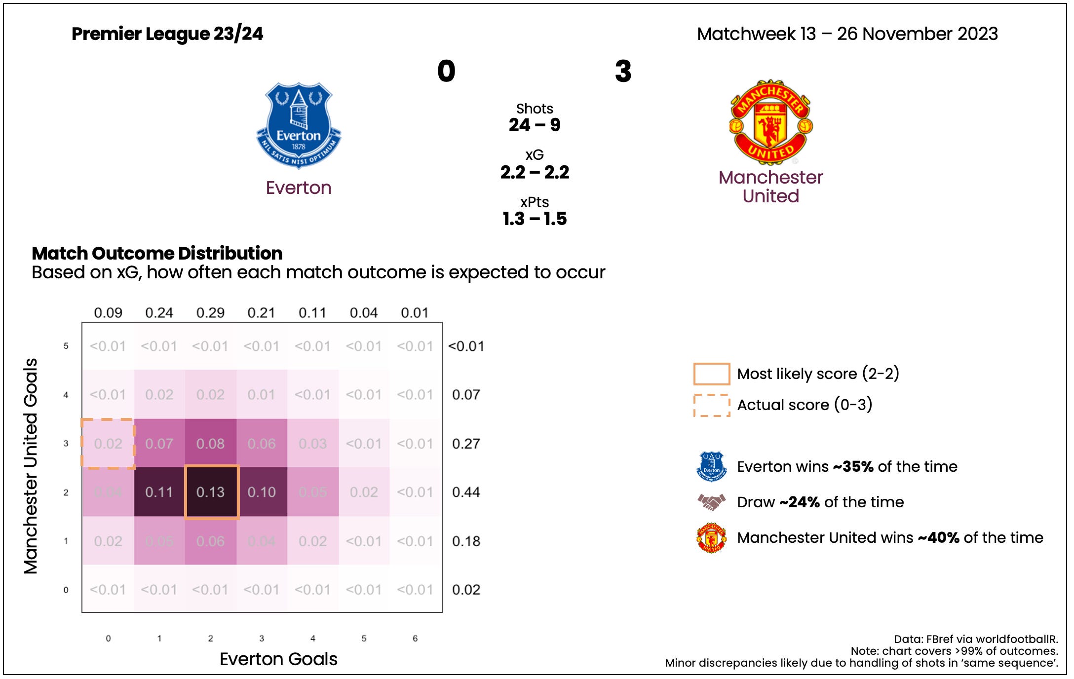
The Red Devils have outperformed their xPts by some distance this season, and here’s an interesting example where they might have got a little lucky. A few notes:
While a draw would have been considered ‘fair’ here, it is only expected about a quarter of the time.
Even though the teams’ xG totals are very close, United win more of the time here. This is an example of quality being better than quantity when it comes to shots. There’s a good explanation of the arithmetic and intuition behind it here.
Even though Everton don’t win as often here, they are more likely to score 4 or 5 goals than United (11% vs. 7% and 4% vs <1%). This is the interesting flipside of the quantity vs. quality. Assuming the same total xG, having more shots will ‘spread out’ your potential outcomes.
Palace show more ‘quality’ at the Etihad?
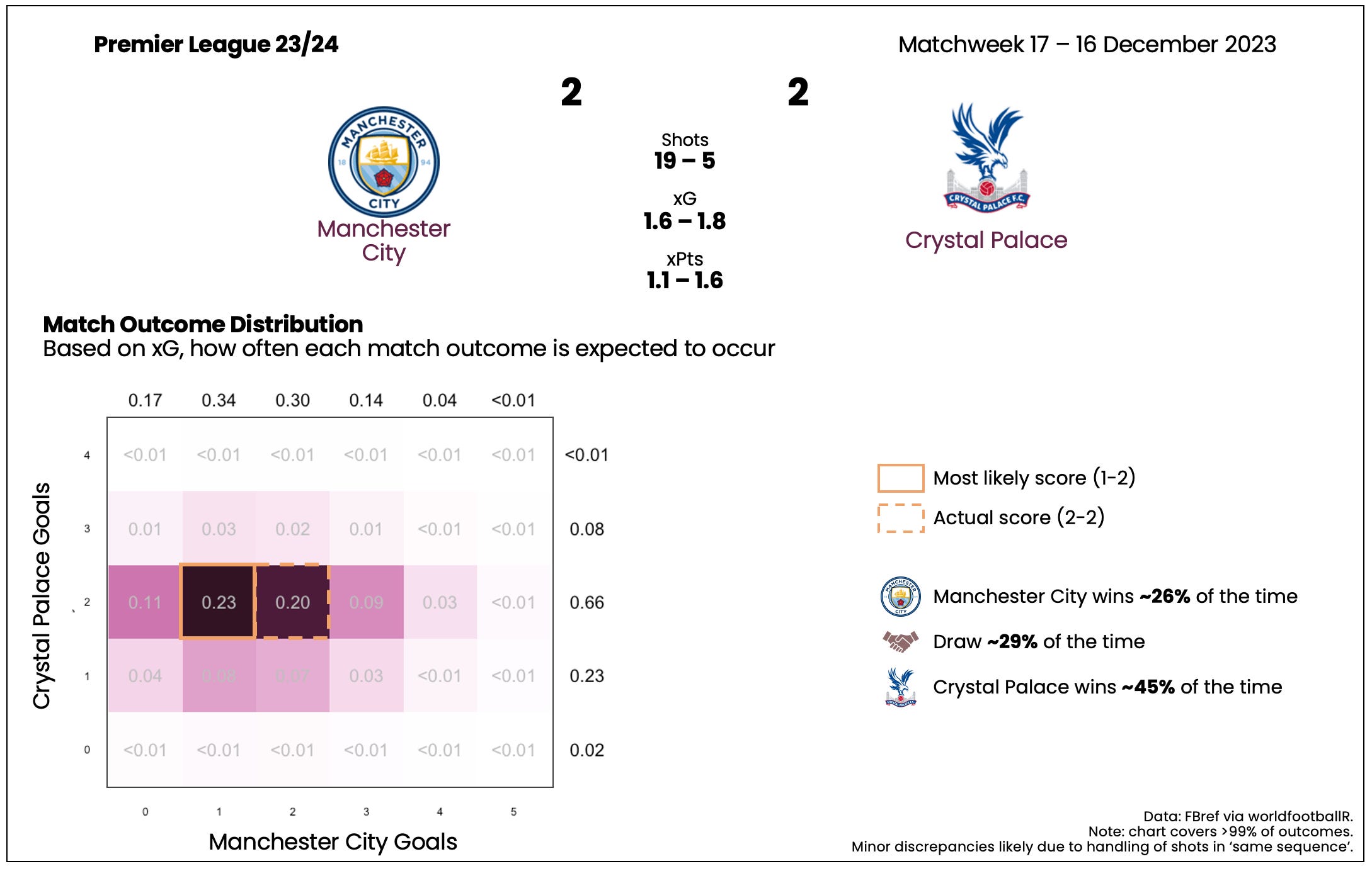
Conventionally, Palace were fortunate to earn a stoppage time penalty to equalise in this one. But, based on the xG they earned over the 90(+) minutes, they were actually good value for the point.
As in the previous game, despite the similar xG totals, Palace - the team with more ‘quality’ shots - are far more likely to win this game. And, again, City - more ‘quantity - are more likely to score 3 or 4 goals, despite an inferior xG.
A case for quantity over quality?
As is clear enough from the last two games, not all xG is made equal. While you can’t just trade-off worse shots for better shots, there is something interesting here. Assuming the same total xG, a team with fewer, higher quality shots will tend to beat a team with more, lower quality shots. Extrapolating a little further, in a meeting of two evenly matched teams, you want to be the team taking fewer, better shots rather than the opposite.
OK, but this still doesn’t seem that useful - it just boils down to ‘create better chances’. (Are you ready to make me a manager yet?)
Consider another scenario. What if you knew you were the lesser team going into the game? This happens most weeks in the Premier League - for example, whenever a relegation battler plays a ‘Big Six’ side.
So, you’re a lower half team heading to the Etihad. You know City score 2 or more goals in most games - they did so 25/38 times in 2022/23. That means you’ll need to do the same to have a chance of a point. And, you know that you’re very unlikely to put up anywhere near 2 xG - City only conceded over 1.5 xG just 8 times in 2022/23. You think you’d be lucky to get somewhere around 1.0 xG. How to play it?
Tough away day - shoot on sight?
This seems like a case where you’d want to ‘chase’ some of the variability offered by taking more ‘bad’ shots, as opposed to forgoing shooting opportunities to create better chances. Let’s test this with a few examples.
This isn’t quite a perfect comparison, but it illustrates a few interesting things:
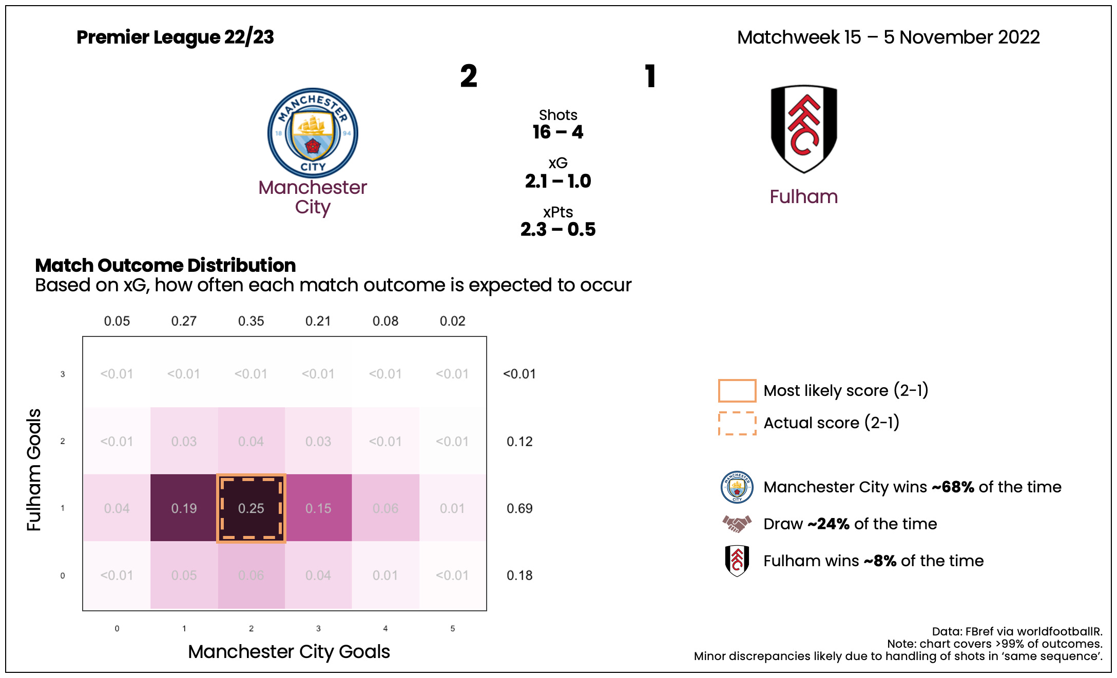
Fulham ‘get a result’ more often. Part of this is because City didn’t rack up as much xG. But, part of it is the quality vs. quantity of their shots - they had just four, of which one was a penalty. Accordingly, they were very likely to score exactly one goal, giving them a great chance to nick a 1-1 draw.
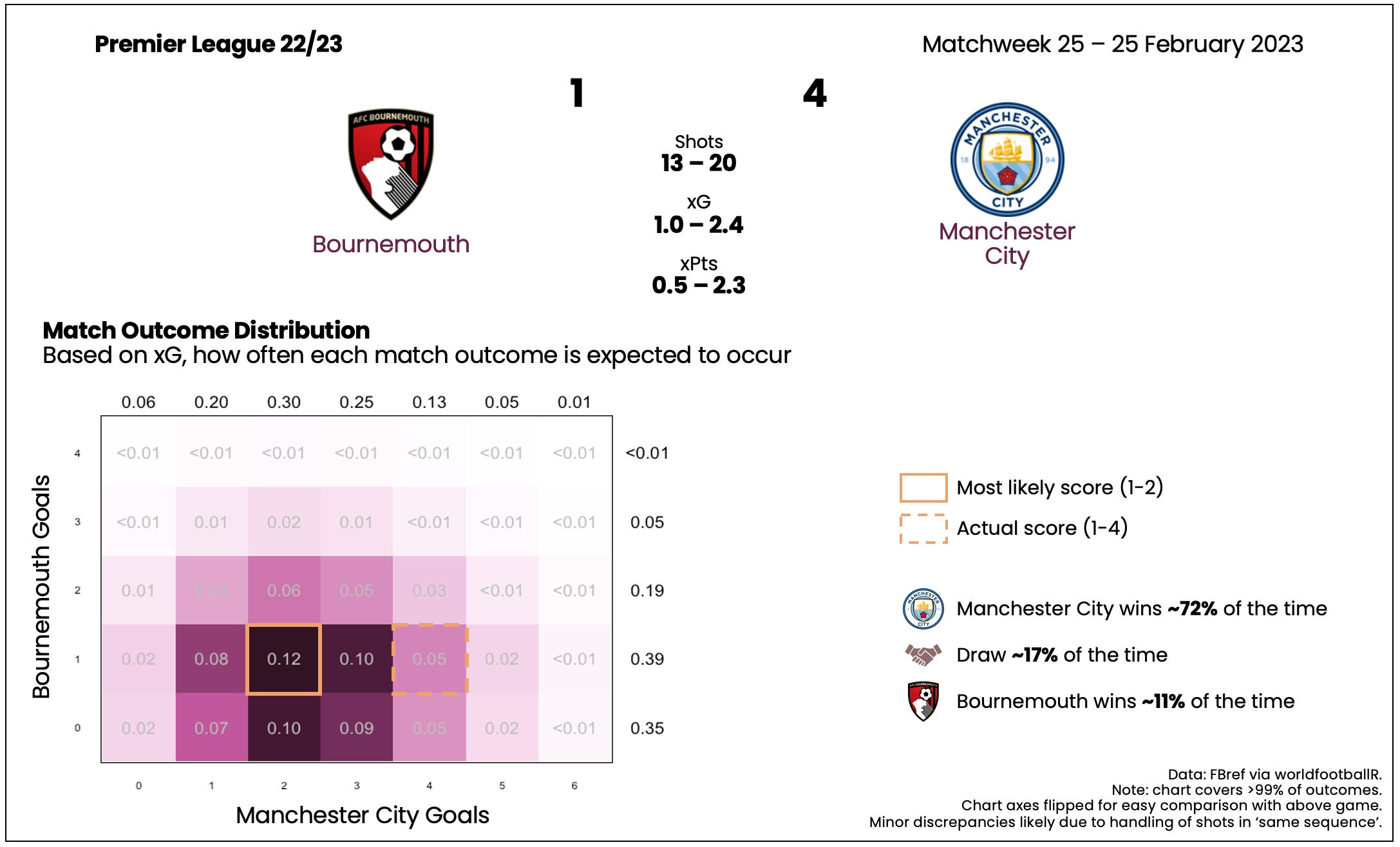
Bournemouth win more often despite conceding more xG. As you can see, with their 13 shots for 1.0 xG, they’re around twice as likely to score 2 or more than Fulham were in their game (~24% of the time vs. ~12%).
What if you put City’s Fulham numbers (i.e. the 16 shots for 2.1 xG) up against Bournemouth’s (13 shots for 1.0 xG) from their City game? You do get something - Bournemouth earn 0.6 xPts, winning 13% of the time and earning a point 21% of the time. An improvement, but not much.
Perhaps the only way to make a case for ‘quantity’ is by assuming City will score at least 2 goals. In this cut, Bournemouth’s ‘quantity’ numbers earn almost three times as many xPts as Fulham’s ‘quality’ numbers (0.22 vs. 0.08). Bournemouth is also about seven times more likely to win than Fulham (~3.5% of the time vs. ~0.5%). These numbers are starting to get very small, and given the practical limitations of this ‘strategy’ (if you can even call it that), it does feel a bit like clutching at straws. On the other hand, I suppose this is the kind of upside you want to look for if you need every point you can get to avoid relegation.
Takeaways: plenty of variation to go around
Visualising expected match outcomes adds another layer to the now commonplace xG and xPts statistics. In particular, it can give you a more intuitive sense how much variance there is between a game’s actual result and the expected (or xG) result. We explored a number of illustrative examples where the heatmap visualisation sparked otherwise hidden insights.
As for quality vs. quantity, the base case is clear: you want quality chances. However, there may be more meat on the bone of the underdog case explored above - perhaps for another time.